What Unfolds in the Room of the Color of the Year?
Like clockwork, Pantone has just unveiled the color of the year for 2024 – Peach Fuzz. But what lies behind this annual event, and how does it influence your color choices?
Since its inception in 1963, Pantone’s color matching system has become the standard in the global design and printing industry. However, color palettes with numeric codes are no longer unfamiliar even to those outside these fields, thanks to the emergence of the Color of the Year.
The Psychology Behind the Color of the Year
Pantone Color Institute began its educational program in 1999, aiming to stimulate conversations around designs and colors. Color plays a vital role in conveying and expressing various cultures worldwide. Pantone aims to make the “language” of these color codes more noticeable, sparking anticipation each year for the trending color.
The first Color of the Year was announced in 2000, marking not only the beginning of a new millennium but also carrying psychological reasoning. Cerulean Blue, the sky-blue hue, brought inner peace and tranquility in the face of the era’s transformations. Pantone researchers synthesized data suggesting that sky blue could help reduce blood pressure and heart rate. Since then, the Color of the Year has become a new trend in design, allowing brands to make a statement through the emotional and psychological impact of color on consumers.

Source: The Glossary
In 2022, the vibrant Veri Peri purple also had a story. Emerging from the challenging years of the pandemic, this color was unveiled with hopes for a stable year ahead. Psychologist Lee Chambers noted that Veri Peri purple instills confidence, calmness, optimism towards the future, and resilience to restart everything.

The color of the year 2023, Viva Magenta, is ‘transformed’ into fashion designs | Source: Women & Home
Moreover, Pantone’s color choice carries significance in the midst of the “real” and “virtual” boundary. Leatrice Eiseman, the executive director of the Pantone Color Institute, stated that the selection of the color of the year is mostly based on nature and the most authentic materials in life to contrast with the digital world we inhabit. For example, the Pantone 18-1750 Viva Magenta for 2023 evokes the cochineal red – a natural dye derived from a beetle species in South America – conveying a sense of preciousness and authenticity.
In essence, the Color of the Year not only sets design trends but also serves as a reflection of our collective mood and aspirations, creating a bridge between the tangible and digital worlds.
How Pantone Selects the Color of the Year
Choosing the Color of the Year is a relentless process for the experts at the Pantone Color Institute as they tirelessly search for the color that can make a significant impact. They delve into various industries, from entertainment, film, fashion, technology, and sports to broader aspects such as economic and societal trends. Pantone scours these fields to find a color with a message that resonates with the evolving culture. For instance, if we look back 15 years, the role of technology was minimal. Nowadays, games, social media, augmented reality, and physical design are all influenced by both technology and color in the digital environment.

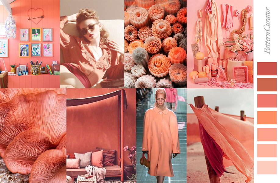
The color of the year 2024, Peach Fuzz, brings a bright and positive feeling | Source: Pantone
While some might think that the decision for the Color of the Year happens swiftly in a one-day meeting among team members, it is, in reality, the outcome of countless lengthy discussions. Pantone’s experts, known as color anthropologists, come from diverse cultural backgrounds and ethnicities. They possess the unique talent of connecting global trends and translating them into the language of color.
Particularly noteworthy is the active involvement of design celebrities in the Color of the Year selection process. These individuals often have their own studios, teach about color, or contribute to shaping color narratives for major brands. Therefore, the decisions made by this team serve as the primary source for the flow of colors that will permeate every nook and cranny of the planet in the upcoming year.

If the color doesn’t exist, Pantone will create it | Source: Impression Magazine
Experts engage in discussions about color psychology and conduct trend research to connect the mood of contemporary global citizens with corresponding colors. They go deeper to pinpoint the exact shade that aligns with the zeitgeist. However, it’s important to note that not every desired color is readily available in the color inventory. If a particular “color mood” isn’t present, Pantone will create it from scratch. A prime example of this process is from 2022 when PANTONE introduced the color code 17-3938 Very Peri, creating it for the first time to designate it as the Color of the Year.
Does it really influence the world’s color?
If you’ve ever watched “The Devil Wears Prada” (2006), there’s an iconic scene where Meryl Streep’s character, Miranda Priestly, talks about Anne Hathaway’s character Andy wearing a cerulean blue sweater. It’s not just any blue; it’s called cerulean, a color used by renowned designers like Oscar de la Renta and Yves Saint Laurent in collections that later became globally popular.
This example illustrates how naming a color and providing specific situational context can influence its impact. This is similar to the Color of the Year. It’s not just a plain green or red; it’s a vibrant hue with unique expressions that, when used skillfully, can work magic.

How Apple ‘fundamentalizes’ the use of the color of the year | Source: Business Insider
The Color of the Year has opened up new business opportunities for companies. Pantone’s key colors often appear in various consumer products such as furniture, kitchenware, and more. Each Pantone selection not only sets a fashion trend but also influences product design and consumption.
For instance, when Classic Blue was chosen as the color of the year in 2020, Apple swiftly released the iPhone 12 in a version mirroring Classic Blue, and it became a highly sought-after item. Prior to that, Apple leveraged the 2019 Color of the Year, Living Coral, to introduce additional color options for the iPhone XR.

Living Coral of the year 2019 | Source: The Hungry JPEG
However, Pantone’s ultimate goal is not merely to promote a specific color. Instead, Pantone aims to educate businesses and consumers about the power of color. Color, beyond being a trend, is a symbol of culture and a reflection of the times.
Not every brand is suited to follow Pantone’s color trends each year. Trying to force a brand to align with a trend can lead to failure. Therefore, flexibility is crucial in referencing and applying color trends.